Building a site in a couple weekends
07-18-2017

The Project
The site needed a redesign with the following being most important to Historical Homecrafters: a redesign for more mobile responsiveness, a clearer flow to make contact, and consideration for SEO.
The Constraints
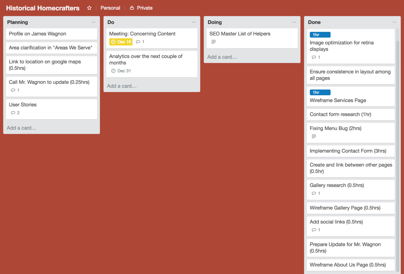
- Timeline: 30-35 hours (!)
- A priority for large text and readability
- Approachable to non-tech world
The Audiences
A large age-range, but usually not first-time homebuyers. Age 45 and above, all local to the Jefferson County area.
The Priorities
Have a clear call-to-action for contacting Historical Homecrafters. The owner is an honor to work with, so the faster I can start the conversation between him and the interested party, the better.
Another is that I wanted to bring a gridded structure that would be consistent across breakpoints, and that within this structure the houses built in the past would be large (and optimized) and apparent throughout the site.
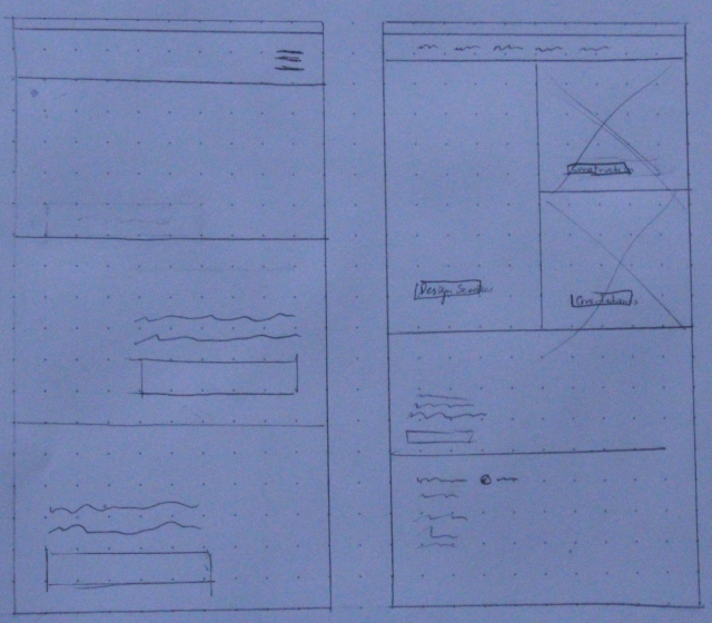
The Process
After listing out all the ideas that I’d like to apply to the site, I began placing all of them against their worst enemy: the aforementioned constraints and priorities. Many of them survived the battle, and I worked to include the ones I felt had the largest value adds, knowing that the smarter I executed, the more interesting stuff I could include.
The Type
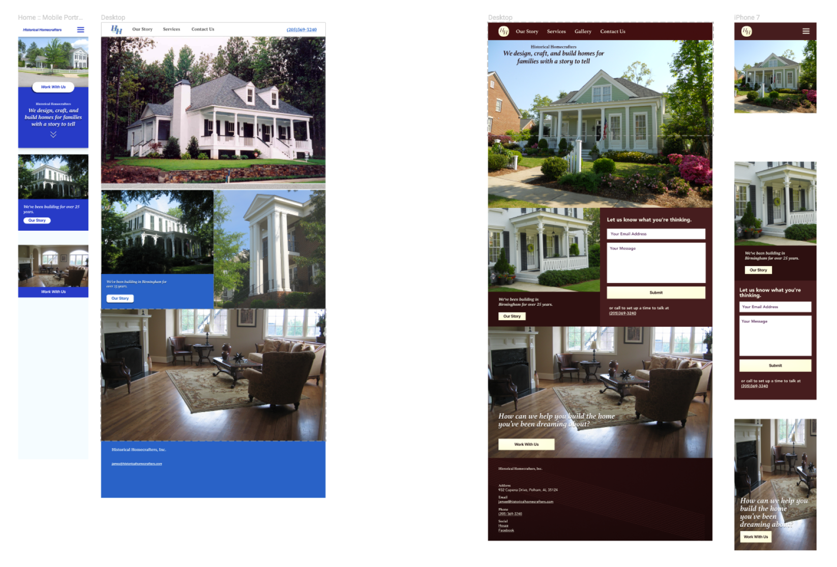
Accessibility is important in order to account for large age-ranges, so I value a large contrast ratio. Our main site colors (#471D1D and #FFFFD9 ) have a 14.1:1 contrast ratio, which is good at any reasonably-sized font size. All text on the site meet the AAA WCAG standard.
The fonts I use are Avenir and Athelas, a sans-serif and serif font, respectively. Avenir is used for clear calls-to-action while Athelas is mainly used for readable copy.
The Color
The two main background colors that make up the site are gradients with small tweaks in saturation, and brightness. The hue however stayed the same for both darker reds. This ends up helping the copy, through trick of the eye, to jump off the screen a bit and gives the rendering a sheen. This enabled me to give the site a newness without having to be too adventurous for a client.
The Result
There are many things I continue to learn (e.g. man, should I have used a static site generator to speed up this process and spend more time on design decisions), but I unexpectedly enjoyed the tradeoffs I made in order to serve the client.
< More writing