Revamp a review card for a college internship reviews platform
03-12-2022
Canary is an internship review platform with hundreds of companies and positions that enables students to inform future students about what an internship might look like. This was an interesting effort to incorporate some design concepts into a compact but integral piece of the platform, the home page’s Review Card.
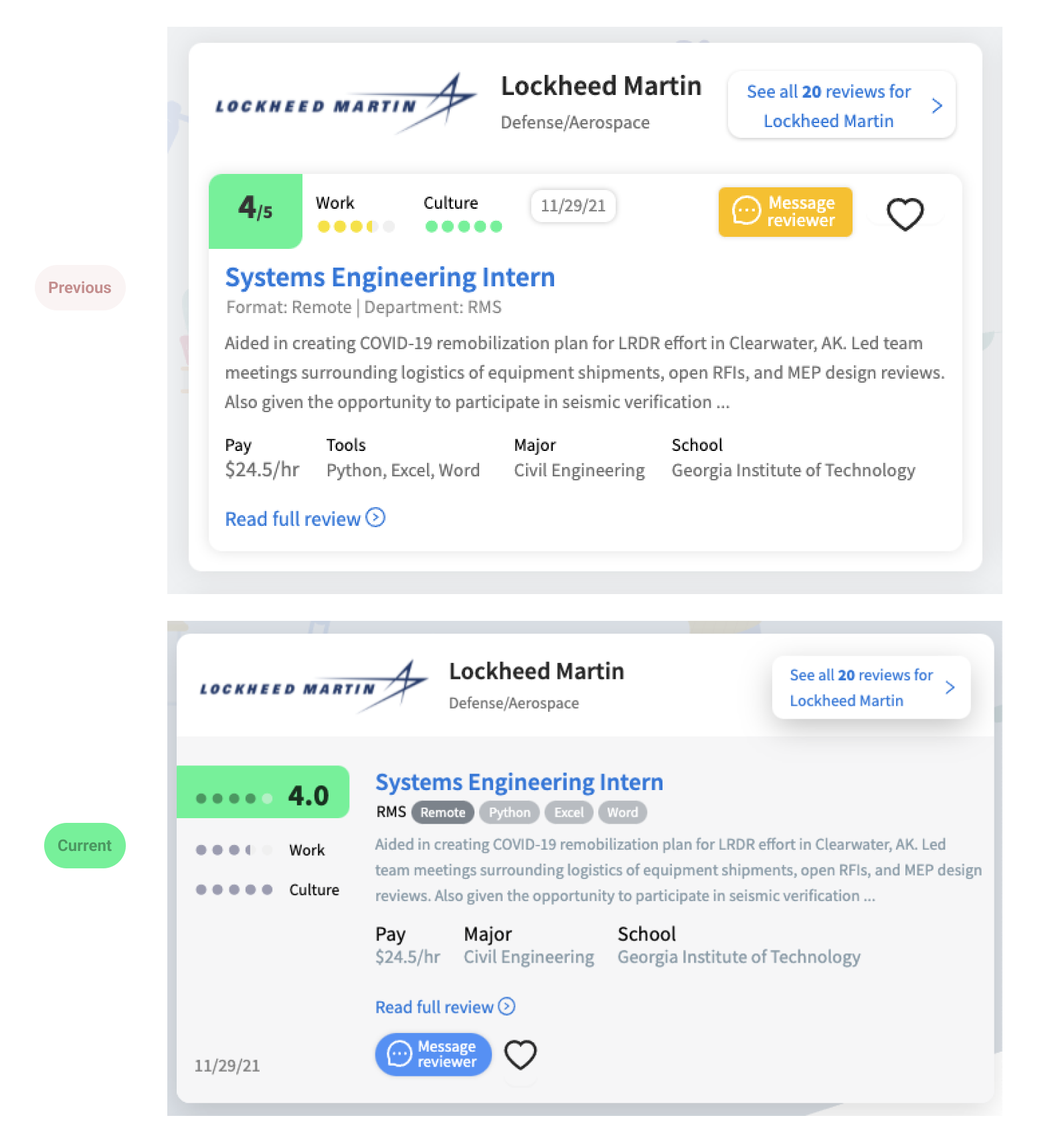
It’s likely the most significant impression on the home page of the direct value that Canary offers to students. Here’s where we started and where we ended up:
My main goals were:
- Give the content on the Review card more space to breathe
- Add more scannability for long lists of these reviews in a feed
- Support more variability in the data
Breathing space
One immediate improvement that popped out to me was that there was a card within another card. Especially on mobile’s limited space, we were losing space for content to box shadows and margins. So that being said, one of the first things I did was merge this into one card, delineating Company info from Review info by a slight change in shades.
A vertical rhythm for scanning
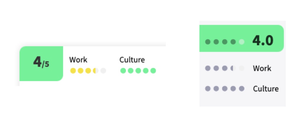
A big part of this home page is how easy it is for a student to quickly scan through many Reviews without losing steam. First, I made the overall score consistent in format with each individual score. Second, I decided to minimalize the Review’s score to only communicate color for the overall score. This leaves only one piece of information to deduce as the student’s scrolling through scores and really helps out with readability.
Room for growth
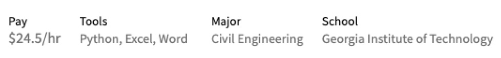
We also gave support for more content if the need arises in the future. One piece of information that stood out to me was the tools used. It was a list of information inside of a larger horizontal row of information. Because of this, especially with longer School names in the rightmost column, there was commonly some content having space issues.
By moving Tools into tags under the job title as well as abbreviating "Format: Remote" into a tag itself, we were able to make this row more dynamic. That way if Canary wanted to start displaying more tools or other ways of classifying each Review, there is room for growth.
Making it happen
All my designs were drafted in Figma. Auto Layout made it incredibly easy to quickly test how it was to scan through this long lists of Reviews. Variants and Prototypes made it convenient for me to test out the look of each call-to-action interaction in the list context.
After sharing Figma files back and forth with Canary, I was able to make these changes for them directly in their Next.js app. Since the site renders this Review Card’s component slightly different across different pages, we had some unexpected turns but we got there!
Here’s a link to the file itself to view some of the drafts along the way. We haven't had time yet for some design changes but I still left them in the Figma file for Canary in the future when time permits. This includes a redesigned callout for writing a new review and custom icons for the top navigation using the brand colors. Feel free to check it out in detail!
< More writing